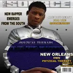
i thought i would dump my crit in the pool... i'm not sure of the look or imagery you were attempting to create, but you have some major issues with perspective, typography, and composition with the cd cover.
first, as far as perspective is concerned, the objects you have assembled into the photomontage should be aligned on the same ground plane, since i don't think you are trekking in outer space with your suv and suburban house. i drew a horizontal line to represent the horizon; it falls where the sky meets the ground, and for an object to be sitting on the ground, its orthagonals (green lines that run perpendicular to the horizon line in 3d space) should converge to a point on the horizon line. that point is called a
vanishing point or VP. i drew lines to determine where your VPs fall, and neither the car nor the road actually land on the horizon. the VPs should intersect the horizon line. the house is ambiguous from this image, even though it looks much too high in the picture plane to be sitting on the ground.
you made several design mistakes with the type: one, it is cramped. especially with upper case letters it is important to give the letterforms horizontal space to breathe. the font you used has an annoying baseline (how the bottoms of the characters align) shift, that looks amateurish instead of grungy. since your picture is the most important image in the composition, you shouldn't cover up your face with the title. bring the text behind the figure at the top and bottom.another suggestion: you ought to make the cd title size smaller than the artist's name, change the weight, or change the color to differentiate between the two. dump the effects too. they don't do anything....
that leads to the composition itself, the most important part. i included a little breakdown of the arrangement of forms, and as you can see, there is a lot of wasted space and cramped forms. the whole area of brown, created by the driveway, on the right is a void that makes the composition unbalanced and ineffective. the viewer's eye doesn't move across the entire surface and gets led to a point directly underneath the title and stops. experiment with moving around the different shapes until you get something that works.
if you have any questions, i'd be happy to help.
good luck.