You are using an out of date browser. It may not display this or other websites correctly.
You should upgrade or use an alternative browser.
You should upgrade or use an alternative browser.
WhiteStrat
Don't stare at the eye.
You were brave enough to ask--so I'm believing you're strong enough to hear the truth. Yeah, it is. Not by tons--but a bit. It's a decent/workable concept, but the execution is a tad amateurish. (I'm a designer, by the way).
I'll chew on it for a bit and come back with some suggestions if you don't mind.
I'll chew on it for a bit and come back with some suggestions if you don't mind.
VomitHatSteve
Hat STYLE. Not contents.
Hmm... How does it look when shrunk down to "crammed on the back of a CD" size? I think a lot of the issues would be cleared up a bit in shrinking.
MessianicDreams
New member
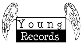
I like the idea and I think that it works well - however I think the wings/feathers just look a bit shit - they could do with being drawn a bit better I think..
E
eeb
New member
You were brave enough to ask--so I'm believing you're strong enough to hear the truth. Yeah, it is. Not by tons--but a bit. It's a decent/workable concept, but the execution is a tad amateurish. (I'm a designer, by the way).
I'll chew on it for a bit and come back with some suggestions if you don't mind.
agreed.
although when I see this I think that this is some sort of youth christen rock label. If this is so then it's definately a workable concept. If not then back to the drawing board i'm afraid.
Nightfire
Aspiring Idiot
Thanks all 3 of you for your honest opinion.
Its not a youth christian label, its supposed to encourage local music. Not really a label, but an in plateau between no-one and indie label. The point is to get the artists to eventually find an indie label (or mayor?) if theyre good enough, this is just a vehicle for them to get going on their own. Hence "young" records.
Young in spirit, young in concept, young in skill etc. For those who arent totally self sufficient enough to market themselves, of for those who dont know that they have the skills, that are just breaking through.
I think the feathers look shit too.
What if I kept the logo super simple without wings at all, just the black and white?
Mike
WhiteStrat
Don't stare at the eye.
B
BLuesBoyDeluxe
New member
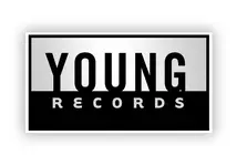
Just lose the wings and you are good to go.
TerraMortim
New member
looks cool either way. it depends on the context.
Riffmaster
New member
Maybe make it round like a record and have the text circular and a little more detail on the wings?
C
Corndog
New member
Just lose the wings and you are good to go.
Seconded.Lose the wings.
C
Corndog
New member
Maybe make it round like a record and have the text circular and a little more detail on the wings?
Round like a record??? Like the Sun logo??? Naw. Too contrived.
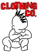
I like my friend Emi's logo fer her punk rock baby clothes.
Attachments
Nightfire
Aspiring Idiot
Thanks for all the replies and the private messages I have received.
I just came home from a trip and am still getting settled in but will come back to you guys in a few days.
Mike
I just came home from a trip and am still getting settled in but will come back to you guys in a few days.
Mike
TerraMortim
New member
I got it. With the wings... a possible idea to make it a little more compact... make the wings kind of wrapping around the sides as if they're in the down position. But really, again.. it depends totally on the context... some designs would probably call for something really compact, some it might not matter so much...depends on the art style.
Nightfire
Aspiring Idiot
Ok, thanks everyone for all the opinions.
Mr. White Strat, I really like the logo you came up with. Very classy, simple, clean and profesionall. However Im not sure if it symbolizes "young records", it looks a little too profesional and mature. I debated about it in my head for a few days since I really like it, but I think Im shooting for something a little more "young" (not that you are old") ) rather than "classy".
) rather than "classy".
Eeb also shot me a pm with a logo he came up with that I feel does a good job at emobdying what Im trying to get at.
Thanks,
Mike
Mr. White Strat, I really like the logo you came up with. Very classy, simple, clean and profesionall. However Im not sure if it symbolizes "young records", it looks a little too profesional and mature. I debated about it in my head for a few days since I really like it, but I think Im shooting for something a little more "young" (not that you are old
) rather than "classy". Eeb also shot me a pm with a logo he came up with that I feel does a good job at emobdying what Im trying to get at.
Thanks,
Mike
WhiteStrat
Don't stare at the eye.
Ok, thanks everyone for all the opinions.
Mr. White Strat, I really like the logo you came up with. Very classy, simple, clean and profesionall. However Im not sure if it symbolizes "young records", it looks a little too profesional and mature. I debated about it in my head for a few days since I really like it, but I think Im shooting for something a little more "young" (not that you are old
Eeb also shot me a pm with a logo he came up with that I feel does a good job at emobdying what Im trying to get at.
Thanks,
Mike
I'm not offended at all. I could never start a company called Young Records, because I'm a design/marketing professional who insists on doing all his own stuff--and I don't do "young" design. Seriously--it's like musicians have a "sound"--well, designers often have a "look." Mine always been classical/clean, even when I was 20. So I completely agree with your assessment.

I just read your thread looking for web design books (I could write one for you, but I can't recommend any good ones--sorry) so I have a better idea of what you're doing. I hope it goes gangbusters for you!
E
eeb
New member
I'm not offended at all. I could never start a company called Young Records, because I'm a design/marketing professional who insists on doing all his own stuff--and I don't do "young" design. Seriously--it's like musicians have a "sound"--well, designers often have a "look." Mine always been classical/clean, even when I was 20. So I completely agree with your assessment.
I just read your thread looking for web design books (I could write one for you, but I can't recommend any good ones--sorry) so I have a better idea of what you're doing. I hope it goes gangbusters for you!
I know what you're saying about having a "Look" however I find myself always trying to take that "look" and doing something different with it.. I love simple clean design.. when they are called for.. but i think i would get bored of design if I was always in the same style all the time.. it's the same with music for me.. do you have a online portfolio? I'm always excited to see work from designers i may not be aware of.. it's often inspiring.
TerraMortim
New member
Round like a record??? Like the Sun logo??? Naw. Too contrived.
I like my friend Emi's logo fer her punk rock baby clothes.
That's actually a pretty good logo.
WhiteStrat
Don't stare at the eye.
I know what you're saying about having a "Look" however I find myself always trying to take that "look" and doing something different with it.. I love simple clean design.. when they are called for.. but i think i would get bored of design if I was always in the same style all the time.. it's the same with music for me.. do you have a online portfolio? I'm always excited to see work from designers i may not be aware of.. it's often inspiring.
I agree--I have to push & grow. I have one client (a textbook publisher) who likes me to redesign his book every 2-3 years. I know some big players switch ad agencies every 2-3 years (no matter how good their work) just to get a "fresh" look. So I try to give this puplisher client that effect--re-invented if you will.
So as a designer, it is like music--you can't let your work get stale. But I'll never do death metal or ska. And that's okay--there's tons of room to grow in the music that "is me." So it is with my design, I'll never do ultra edgy or pop art--but there's plenty of room for me to grow in the clean/bold/elegant world where I live best.
E
eeb
New member
i hear you..
I like to mix things up a little more personally.. back to the music example.. i'm with you.. i'll never play metal or ska.. however i might take some elements from metal or ska and twist it in a new way.. some of the new material my band is working on it totally not something i ever thought i'd play.. went from indie rock to stoner rock almost.. but still with that indie twist.. I'm the same with design.. at my core i like simple clean designs but lately i've been adding that edgy/pop art spin to it... I love how no two designers are the same.. keeps the industry fresh and on it's toes i think
I like to mix things up a little more personally.. back to the music example.. i'm with you.. i'll never play metal or ska.. however i might take some elements from metal or ska and twist it in a new way.. some of the new material my band is working on it totally not something i ever thought i'd play.. went from indie rock to stoner rock almost.. but still with that indie twist.. I'm the same with design.. at my core i like simple clean designs but lately i've been adding that edgy/pop art spin to it... I love how no two designers are the same.. keeps the industry fresh and on it's toes i think
Similar threads
- Replies
- 95
- Views
- 12K
R
K
- Replies
- 0
- Views
- 351
K