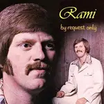
I don't know where to put this...

  • Thread starter Thread starter RAMI
  • Start date Start date
CIRO said:
RAMI:

Stevie Wonder probably will love your CD (and cannot see the cover) :D
HAHAHAHA!!!!

You just made tequila come out my nose!!!

Don't ever do that again....

My incredible girlfriend made a few changes and I'll put them up soon. :D
 
RAMI said:
HAHAHAHA!!!!

You just made tequila come out my nose!!!

Don't ever do that again....

My incredible girlfriend made a few changes and I'll put them up soon. :D


Girlfriend?

But...Paisley?

You promisse a lot of things to him :D
 
I just updated the pic. Rhonda came up with something pretty much the same as what we had ( I was still pretty stubborn about this idea, I believe in it), but with a few color changes, and a few other subtle changes. I like this, but I want to know what you all think. Also, the real thing looks alot better. For some reason, I wasn't able to convert the CD cover project to a Jpeg. So I scanned it and then posted it. So the quality is nowhere near what the cover actually looks like.

I want to thank everyone for their input. We got some great ideas from everyone's input here.
 
I think that color version looks cheap...posted on here anyway. The black and white is classy...and the Rami looks good too. :)

Waiting to see what your girl did though.
 
It seems to me that , on color version , our "little Rami"
is more "innocent" :rolleyes: with relation "sex/drugs...",
(maybe because this color cover has a more "open",not so "close" point of view?)

I like both, but my vote is for the second.Your girlfriend did a good job.
Well, the first works too, it seems more "classic", but more "in face" and KINDA "my name is little Rami, all I want in my life is..." :D

"tradicionall people :eek: " Will be less "shoked" with second cover
...But...(WHO CARES?)

*I´m not reading RAMI so well on second cover, but certainly it´s a copy issue, as you mentioned.
 
Last edited:
I haven't had the chance to read the whole thread yet (I'm sick of reading threads at the moment), but i will.

I think the 1st cover was cool as hell, granted, it could have been done with better graphics and personally i would have put "Religion" on the lunch box to really set off the exsisting visual sub-text that at 1st glance made me want to know what your cd was about.

-Just some feedback-
 
How bout this:
 

Attachments

  • rami.webp
    rami.webp
    26.9 KB · Views: 55
Shit man,,,confused....confused...I don't know where to go with this. I really like this color thing. And it really does look better in person. But since the cover will be seen on the internet alot (and sometimes down to one inch dimensions) it does matter what it looks like on a computer. And I realise it doesn't look great on a screen.... :(

I had already thought of what Gorty did. I think it looks GREAT. But, it's simple and maybe not too memorable. It's nice to say to myself; "Let the music speak for itself"...But there's so much music out there that it would be nice to grab people with the visual a little bit. That's why I'm scared of just having a simple cover and hoping the "music will speak for itself"....I do want to somehow slightly shock or at least make people look for an extra second.

(By the way, I don't like the leash on the girl...) I'm more or less about everything in that pic, but not the leash (unless she's willing of course....hehe), so that's going to go for sure...This ain't Spinal Tap...Smell the Glove.. :eek:

Goerty's pic is great, I think for a more "established" artist. Classy as hell.

David K's is the best....But people would be disappointed when they see I don't really look like that....:D :D :D :D

Thanx guys....decisions...decisions.
 
Last edited:
Read the thread.

Gorty's is cool, reminds me of 3rd eye blind or something.
I liked the stacks of cash Breeza used and while the leash chick does make me think of smell the glove, i think the idea is right on track, not JUST sexual , but kinky sexual which is almost funny.

I still say put the world "religion" on the lunch box like the images in the thought bubbles are on the kid's mind, but he'll face his day with a fat sandwich of societies conformity and guilt, and thus must rock!
(Could be a lot of different sub-text derived from it actually and that's a universal good thing to me.)

Kind of reminded me of that Clash, reggee style cover art.

:)
 
Bill....I hear you. If you look at my (the kid's) right elbow, you'll see it's cut off. My idea was to put the Bible there to cover the part of the arm that's cut off, so we're on the same wavelength. But, while I'm not at all scared of controversy, I don't want to come off like I'm trying TOO hard to piss anyone off. I then thought of a book beside the arm, and on the book, something that represents "goody-goddy...ness :D" but is playful, like "Every Good Boy Deserves Fun..." or something, which is also a musical reference.

My girlfriend has a great idea but hasn't presented it yet because she needs to take another picture of me for it. So it might not be this cover at all. I think she wants to take a picture of me in "The Thinker" pose and work with that.

This is fun, but it's also a little frustrating. I think I like making music better, but this is a nessaccary step.

Thanx again for all the input, I'm enjoying it, but I just want to get this done. :)
 
Oh, another thing. The word "classy" keeps coming up...I'm not looking for classy. While I realise my music is NOT garage-piss-off-whoever-you-can-punk...I'm also not Steely Dan" or Michael Boublee. So I'm not too concerned with being "classy" :D...I don't even mind a little "cheap". That's the only reason I wouldn't use Gorty's idea. It's classy as hell and very pro looking. But I don't think it represents me.
 
RAMI said:
It's classy as hell and very pro looking. But I don't think it represents me.
But you are looking through a foggy lens. I think classy and pro very much represents you, not to mention that people 'buy' classy and pro.
 
NYMorningstar said:
But you are looking through a foggy lens. I think classy and pro very much represents you, not to mention that people 'buy' classy and pro.
That's possible. I might not hear my music through the same ears as anyone else.

Also, I just want to say that when I said I like Gorty's idea but, etc....I really meant it. We started working on a whole other idea for the cover and what we will probably do is use Gorty's idea for the actual CD disc itself. I think it would look great on the round CD. Stay tuned...and all that shit. :D
 
Just put up another idea. Starting to lose perspective just like when you work on a song too long. I loved the idea of the kid, but there will be other opportunities to use that. With the title "Thinking Out Loud"...it seemed too obvious that I had to be "The thinker". We can use my kid pic for another project. We are going t use Gorty's great picture for the actual CD itself and the man will get credit for it. I hope this works, let us know. thanx alot.
 
I prefer the latest version with you as the "Thinker", as well as the colorful background. Gorty's version for the CD is also very cool. I was going to suggest colorizing the photo of you as a child - not applicable now...

I was wondering - how are you printing the CD label - are you using a printer or a standalone label machine? I'm looking at moving from a magic marker to something a little more professional.
 
Well I have a shitty (or slightly better than shitty) HP ink jet printer. I'm thinking of taking them to a printing place. My problem is finding good paper. I find that the Office Depot stuff isn't as good as whatever the pros use.

Actually, this would be a good question for the LPC dudes. How did you get your CD's done. It's on that pro glossy paper and looks pro, too. That's my next step and I'm not sure where to go with it.
 
RAMI said:
Well I have a shitty (or slightly better than shitty) HP ink jet printer. I'm thinking of taking them to a printing place. My problem is finding good paper. I find that the Office Depot stuff isn't as good as whatever the pros use.

Actually, this would be a good question for the LPC dudes. How did you get your CD's done. It's on that pro glossy paper and looks pro, too. That's my next step and I'm not sure where to go with it.
So your HP inkjet can print on CD's ? Do you need some special CD's to print on - like that already have a sort of paper coating on them? I'm off to the LPC thread to ask them about their insert...... :cool:
 
Back
Top