My studio's new website

  • Thread starter Thread starter wjgypsy
  • Start date Start date
I emailed freeservers about the link promblem and i havn't got back any reply yet. i'll try out that other site.


thanks

zeke
 
I visited my site but i didn't see but one or two pop ups. And i don't know why the links aren't working.
 
zeke,you have quite a few spelling errors on the page.
Might want to get those taken care of.
 
LOTS of errors in your grammar!
You need to fix those.

The banner ad drives me crazy.

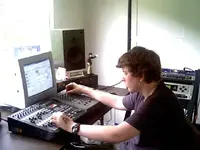
Zeke, you HAVE to do something about that dangling power strip and the "bird's nest" of cables behind it.
Nothing SCREAMS amature more than bad cable management.
Fix it, and take another picture.

Zeke Sayer Is the Owner/Founder/Engineer of Square One Recording Studio
Too many slashes. Drop the "Founder".

Along with his supportive parents and friends, Zeke turned what was a "Home Studio" in to a Semi-Pro Recording Studio. Zeke says that he hopes to be engineering and or producing in major studios when he is a grown man.

Rephrase that to read:

Continued support from his parents and friends has enabled Zeke to transform his once "Home Studio" into a Semi-pro Recording Facility.
A long term goal for Zeke is to be involved in audio engineering and music production at major recording facilities. Operating Square One gives Zeke the real world experience that moves him one step closer to that goal.

(Or something along those lines....)

I could go on, but you get the idea.
 
Last edited:
I assume you can edit your site right? So take all the text and copy it and run it through a spell checker, then paste it back corrected. Then check that bad link to the correct one, it is probably just a simple error. The navigation menu is fine.

And yes, the adds are annoying (mostly the pop ups), but I guess that is what you will get from whoever is hosting your site.

Keep at it!
 
Hi Zeke,

well, if I had to grade this web site, I would give it an F:

bad design & color scheme, "file not found", typos, banner-ads, even pop-ups (!!), etc. You pretty much did everything wrong you can do wrong. I even get a "security warning" from my browser if I want to check out the photo page.

Why don't you browse the web and try learning from other web sites which you like most? Also, get FrontPage or other software that lets you design websites in an easy way.

Botom line is: a web site is like a "business card". Having seen your site, I would never do business with you. Keep that in mind for potential customers. Sorry for being so harsh, though ;-) I know its not easy if you just got started.
 
Re: broken link

Zeke - you need to put a "http://" in front of your link to the sound samples, that's what's causing the dead link. The link is looking for a local file:

http://www.squareonerecordingstudio.4t.com/www.nowhereradio.com/zeke/singles

when it should be looking for:

http://www.nowhereradio.com/zeke/singles

Just make sure you type the whole address into the link, instead of just "www.whatever.com", or it will think it's a local file/dir. Let me know if you need more help with this -

travis
 
Thanks for the replys. I like your Onesty. I will get to work desinging a new site. maybe even changing the hoster.


zeke
 
One thing i can't figure out. I visited www.phatboystudios.8m.com (another free website by freeservers.com) and there was no pop ups. the only pop up was as i was leaving. when i clicked the "x" buttion on came up and i closed it with no problem. The same thing happened at my site. i'll get to work redesignign it.


Z
 
subtractor said:
Zeke, is that a fat joint between your fingers in that pic?
Haaaaaaa! It does look like one! Cool pose with a big fatty! Well, maybe not :D
 
ha,ha.
I believe it's just the walls you see between a gap between two fingers.

Anyway, I wouldn't have the word "page" following every link name:
"Photo's Page"
"About Page"

read each link down the list and it sound rediculous, the person reading it will start to sound like a stuttering, redundant- assjack.

I would scrap all the picture of you standing there "looking cool."
And if you must have a picture of yourself, I'd make it one of you actually doing something like- playing guitar, drum, or actually engineering- like moving the faders on your mixer/recorder.

Look like you have purpose rather than what looks like a kid by some empty walls. Be around your studio equipment look like you're proud of what you have right now.

I know if I was looking for a place to record, I wouldn't want to visit the studio site and see some guy posing in front of a generic wall.

Also, get quality photos.
Get a better image on the "photo PAGE" of the drumset, 'cause that looks like crap.

Instead of "Favorite Links" just put "Links" Obviously they're a favorite if you want to share them with those visiting the site.

Like someone else said, take another image of the 'rack gear' with the wires cleaned up, I would also re-rack the gear so there's no empty slots between each piece of equipment in the rack. Or get some blank panels and fill the spaces.

fix the counter on the main page, you screwed up the tag somewhere.

try and take a different photo of your mixing space, if you want sun lighting it in, wait 'til it's going down. Or somehow dim it outside, because the bright sun outside your window makes the mixing area look bad. When I look at the picture my attention is thrown from what equipment is at your desk, and instead directed to the blinding sun.

Rather than 'what's new page'
How about "News," something simple.

Take out the description, or at least "here I can tell visitors." It makes it look like the page was made by you to show someone else directly.

"Here I could tell visitors about new additions to my site so they’ll be sure to see my most recent pictures and information."

make it something like:
"This section is so I can point out the new additions to Square One Studio..."
I actually might leave it that simple, I'd try and stay low on the "MY site", "My Studio" and replace My with the name of the studio. Yes, it may be YOUR site, and YOUR studio. But it's a studio with a name, and you want people to know that studio name. Embed it into their skulls.

You're going to be sharing that studio with clients, at that moment it is their studio too.

It's like when you work at a store and someone is buying some pants and you're selling something with it. Right then the store owns the pants and everything else. But you say "do you want to pick up a belt to go with YOUR pants." (not the STORES pants, but their's.)

You're trying to sell them studio time, so stop pointing out that it's YOURs. They know it and you know it. But stop shouting it.

anyway, that's about it.

oh, and you might better organize the listing of equipment used. Rather than throwing what you use in parenthesis, and make a dedicated "Equipment" page (without the word page actually being in the link name)

okay, I'm done.
Good-luck
 
Will this one do?

:D
 

Attachments

  • punk.webp
    punk.webp
    45.3 KB · Views: 233
ZEKE SAYER said:
Will this one do?

:D
Maybe wash that "minor" stamp off your left hand, or whatever it might be...;)
And again, a little better "mood type" lighting would be better than the sunlight.:)
 
hey can you make some buttons for your site? i'd give it a little more presentation to it.

hey i could do some flash buttons and/or maybe a kind of logo...
i dont know, let me give it a try

hmmmm... dont do that "im the owner/engineer...look at me" thing

if you own a SEMI-PRO studio.. act like a SEMI-PRO guy. people doesnt want to record with a guy that posses in a wall

you're doing fine
 
zeke

I think you should follow the advice that someone gave in an earlier post and just list your gear instead of showing the pics. Just glancing through your pics im not very impressed. A tascam porta studio, a digital fostex recorder, some behringer rack gear and some knock off guitars aren't what i would consider "semi-pro". Regardless of what you can do with this gear I think potential customers are going to see the pics and be turned off. Just something to consider. Heck it might even be in your best interest not to show pictures of yourself. If they only hear your recordings and don't know that your a younger guy they won't be able to judge you because of your age.
 
I hate the studio photos too. I'm not going to take anymore more photos of them until i get the whole studio done. trust me. I'm going to do the control room like this: Brownsh/red paint, Track lights, Lite blue carpet (less than 1cm high), Maybe a wooden finish control desk for my recorders, mointors and computer monitor. Trust me. It will look 15 times better than it does now. (Oh! and i want forget the big black producer's chair either ;) )

Subtractor- The thing on my hand is a temp. tato that reads: M H
(for Metal Head ;) )

wireneck- That isn't a tascam porta studio. It's a Fostex Xr-5. It was my first "real" recorder. Still get's some pretty warm sounds. About the only thing i useing for is for things that my digital recorder won't do like tape reverse, (to get a "Beatles" sound :D )and stuff like that.


Memogtr-I like the sound of that. tell me more......


Z
 
Back
Top