Let's talk logos

lomky

New member
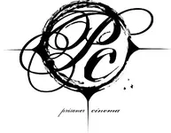
So we are changing our bandname, there is a story behind it. It refers to the colors you see when you rub your eyes or are in solitary, and our Guitar player who is blind sees them all the time. So we want to actually take things a little more seriously in this incarnation. Anyway, a logo that I like (my wife is a designer) is attached, it has a circle that represents an eye, and the three spikes represent us as a three piece.

The problem with the name is the fact that the initials are PC which has alot of other meanings.

We are still working on it so, thoughts?
 

Attachments

  • prisoner.jpg
    prisoner.jpg
    56.8 KB · Views: 115
Last edited:
Overall I like it.

If it were me, I'd lose the (distracting) abbreviations in the center of the eye circle and just leave the name at the bottom. All that clutter looks bad. (imo)

less is more in this case. without that I think it looks great. I could see just the eye circle as a sticker on a car.
 
I agree with VSpace. Lose the letters in the middle and it will look a lot better. Looks pretty cool as it is though.
 
I concur. It looks good, but it's way too busy. I hadn't even realized it was an eye until vspaceboy said so.
 
Agreed, too busy. Perhaps have her make the eye just an eye (not just a circle, but with something in the middle for the pupil, etc, and leave the wording the way it is. very cool!
 
Yea - Making It An Actual Eye Is Definitely A Good Way To Go . . . AS interestomg as it looks, I don't really see the reference to those "colors" you C when you rub your eyes though . . . was i supposed to "get that" from looking at the logo itself or was that just some of the inspiration behind the change?
 
Fieva said:
I think going with more of an eye would be better. Less is more like other have said.

Since we're on the topic, here's mine (a small avatar version anyways).

http://a79.ac-images.myspacecdn.com/images01/11/m_9d4d80c14f8eb3cc6835cbe14ac3b156.jpg

Looks ok. The logo in the middle looks a little rough but that's probably from resizing.

Most logos (at least company logos) are made with vector graphics instead of raster. So they can be resized to whatever and still look just as good.

Vector graphics are just files that store coordinates (x,y, etc.) where raster (bitmap) images store actual pixels. Coordinates can be changed and then redrawn with perfect quality whereas pixels are either lost or interpolated depending on if the image is being resized down or up.

If resizing is important I would suggest maybe looking into vector images or drawing your logo at a really high resolution.

Not sure why I just said that or if it makes sense but maybe someone will find it useful. ;)
 
Like suggested, stick with the eye but put something in there, like a pupil with a basic cp in the pupil or something.

danny.guitar said:
Vector graphics are just files that store coordinates (x,y, etc.) where raster (bitmap) images store actual pixels. Coordinates can be changed and then redrawn with perfect quality whereas pixels are either lost or interpolated depending on if the image is being resized down or up.

If resizing is important I would suggest maybe looking into vector images or drawing your logo at a really high resolution.

Not sure why I just said that or if it makes sense but maybe someone will find it useful. ;)

Well for what its worth, I learnt something new today from that post :)
 
Well, we did what most of you suggested and cleaned it up a bit, and I gave both to my band. They actually liked the original (that's all that counts I guess) we have an almost metal sound so I guess busy is the name of the game with this stuff. Thanks for the suggestions you all. I really appreciate it.
 
danny.guitar said:
Looks ok. The logo in the middle looks a little rough but that's probably from resizing.

Most logos (at least company logos) are made with vector graphics instead of raster. So they can be resized to whatever and still look just as good.

Vector graphics are just files that store coordinates (x,y, etc.) where raster (bitmap) images store actual pixels. Coordinates can be changed and then redrawn with perfect quality whereas pixels are either lost or interpolated depending on if the image is being resized down or up.

If resizing is important I would suggest maybe looking into vector images or drawing your logo at a really high resolution.

Not sure why I just said that or if it makes sense but maybe someone will find it useful. ;)


Good advice and I may want to look into that at a later time, but for the most part I have 3 different sizes of the logo. Those should do the job nicely.
 
lomky said:
Well, we did what most of you suggested and cleaned it up a bit, and I gave both to my band. They actually liked the original (that's all that counts I guess) we have an almost metal sound so I guess busy is the name of the game with this stuff. Thanks for the suggestions you all. I really appreciate it.

Well, all is good if everyone is happy, but this isn't really true... if you are in it to please the fans and draw them in, a logo is just another way of attracting listeners... if it sucks and draws no one in, it really doesn't matter if the band likes it because it was ineffective.

Not slammin on ya - the original logo is perfectly fine (not a night and day sort of thing)... just pointing out that if you are in it to be famous (the general 'you'), you want to do as much as possible to please the crowd, perhaps not so much the members of the band. And if they are so displeased that the band breaks up over something like a logo, I think there were deeper issues to begin with :)
 
Back
Top