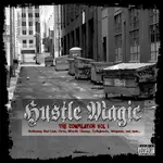
Hustle Magic - Album Cover

  • Thread starter Thread starter Change of POETS
  • Start date Start date
Cover

Hey, that blur streak and that color change on the buildings is tight! Keep that! I like the old title more. You really put good work to make that title bling. I think you should keep that bling! All I was saying is the old title blended in to the background. Hope you can get that old font back... :rolleyes:

I hope I'm not slowing down the flow. :( I just think this could be a really good cover! :D

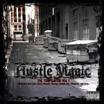
What if you made the cover look like it got torn away where the title is?
 
BeatsBuY said:
Hey, that blur streak and that color change on the buildings is tight. Keep that! I like the old title more. You really put good work to make that title bling. I think you should keep that bling! All I was saying is the old title blended in to the background. Hope you can get that old font back... :rolleyes:

that bling font can easily be put back, i just layered it. the original graphic belonged to Change, i just put my little twist to it. if he likes it i can get his files do my manipulation and submit my project files to him. it really depends on Fieva.
 
ok, here is another version.
 

Attachments

  • Hustle-Magic-Cover-redcros2.webp
    Hustle-Magic-Cover-redcros2.webp
    59.3 KB · Views: 63
Hey guys. I didn't mean to butt in on your design ideas. I know this is a group effort and I hope I didn't just come in and seem rude. :o

I also design album covers and just had some ideas. Let me know if I'm slowing down your process. Let me know if I can help more if you want to exchange ideas. :D Sometimes I may try to help too much....
 
Me personally, I like the new additions to the cover, but with the old logo
 
BeatsBuY said:
Hey guys. I didn't mean to butt in on your design ideas. I know this is a group effort and I hope I didn't just come in and seem rude. :o

I also design album covers and just had some ideas. Let me know if I'm slowing down your process. Let me know if I can help more if you want to exchange ideas. :D Sometimes I may try to help too much....


feel free to continue providing as much information as you can. i'm just like you, i design album covers also and this really isn't my project. i just decided to put my hands on the project since Change of Poets motivated me with his design.
 
Fieva said:
Me personally, I like the new additions to the cover, but with the old logo

that's cool, if change wants to shoot me his designs then i can add mine with his and then forward it back to him or you.
 
Yes I agree. The new added stuff is good. Keep the original title logo. :D
 
Im all late and sh1T ..I like whats change did with the Cover ..its sends a real good message about what we trying to do..I know everyone wants the bling in it..but i like what Jug did with the font on the 1st one he did..it gave it its undergrond feel like we doin it street..JMO.. real nice job to the both of you..keep up the good work..
 
bknot1 said:
Im all late and sh1T ..I like whats change did with the Cover ..its sends a real good message about what we trying to do..I know everyone wants the bling in it..but i like what Jug did with the font on the 1st one he did..it gave it its undergrond feel like we doin it street..JMO.. real nice job to the both of you..keep up the good work..

what up bknot? thanks for the feed. Change is the man, he baked the cake, i just put the icing on it because so many people requested that it needed more.
 
Yo Jug, I can send you the PSD file and the ttf's for the fonts I used.... It's a few mb's in size, though.

Or I can send over AIM if you want. Get at me...

Me, I prefer my design...:D

I just like it simple and to the point, but that's just me... Ya'll are more than welcome to do whatever with it, it is a joint effort on this whole project. ;)
 
Here's one with the Stroke on the bling font, and a semi-transparent gradient layer behind it to make it "pop" a bit more. Brings more focus to it.

Jug, I dig the coloration of the pic in that corner, and the blur... How did you do that?
 

Attachments

  • Hustle-Magic-Cover2.webp
    Hustle-Magic-Cover2.webp
    53.3 KB · Views: 40
Change of POETS said:
Here's one with the Stroke on the bling font, and a semi-transparent gradient layer behind it to make it "pop" a bit more. Brings more focus to it.

Jug, I dig the coloration of the pic in that corner, and the blur... How did you do that?


for the coloration i added a gradient fill and then i mulitplied the intensity. for the blur effect, i actually took the hustle magic title and pinched it, then i stretched it our vertically and after that i dropped the opacity on it.

the stroke does a good job seperating it from the backdrop. you can upload the zip file on www.yousendit.com and e-mail me the link at MRPATRICK357@HOTMAIL.COM or you can catch me on aim like you said. my aim handle is: REDCROSS44355279687
 
Lookin Good

Change of POETS I like the stroke and the transparent background.

jugalo180 like the coloration and the streak.

I think if you both put those ideas together you got something! Lookin good... :D

I like the original border. It's nice and clean.
 
Hey
Is There Any Way To . . . Perhaps Add A "message" Onto The Big Trash Cans I The Alley ? And Make It Look Like The "slogan" Or Whatever Was Painted On To The Cans?
 
gullyjewelz said:
Hey
Is There Any Way To . . . Perhaps Add A "message" Onto The Big Trash Cans I The Alley ? And Make It Look Like The "slogan" Or Whatever Was Painted On To The Cans?

that is definitely possible. i'm waiting on Change to e-mail me the file or a link to the file.
 
jugalo180 said:
ok, inbetween erasing some of my whack ass beats i had time to add a little to the picture. i added black font and a little effect to the original title of the cd to give it a Money look, it turned out pretty descent i think. if i had the original files, it could have came out a little better.


this one has more impact
 
So how's the cover lookin? I know there was a lot of good ideas and would be cool ta see it all put together... :D
 
Back
Top