You are using an out of date browser. It may not display this or other websites correctly.
You should upgrade or use an alternative browser.
You should upgrade or use an alternative browser.
jugalo180
www.moneyistherecipe.com
that's hot! i checked out that one link to your web design, NIIIICE work.
ethos
Swag Type Heavy
wow.
I dont have anything to do with hustle magic, but that shit is ill man.
nice work.
I dont have anything to do with hustle magic, but that shit is ill man.
nice work.
Change of POETS
New member
Good looks, fam. Glad you feelin it.
pcp
New member
hell yea thats a perfect album cover
Fieva
facebook.com/fieva
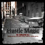
Like the theme with it, since we decided gritty/grimy/street with a touch of bling worked well with it.
Seems that something is missing that gives it that extra "oomph" (can't figure out what the hell it is though...might just be me) but I won't front, that's good work
Fie.
Seems that something is missing that gives it that extra "oomph" (can't figure out what the hell it is though...might just be me) but I won't front, that's good work
Fie.
D
distilled
New member
Honestly, I thnk the borders should be cracked and sort of fuzzy, if you know what i mean. To give to the same look as the street has.
And the street needs something adding to it, im not sure what, it might even just be a little contrast, but t looks far too plain to me.
And the street needs something adding to it, im not sure what, it might even just be a little contrast, but t looks far too plain to me.
gullyjewelz
New member
i like the pic!!! bam!!
it would be mad cool if we could have a "group shot" of everyone on the compilation BLENDED into the pic - - - but obviously we live so very scattered about - i suppose this would be impossible -- ?
it would be mad cool if we could have a "group shot" of everyone on the compilation BLENDED into the pic - - - but obviously we live so very scattered about - i suppose this would be impossible -- ?
Change of POETS
New member
All comments is cool and respected.
I like things simple, and meaningful... To me, the bling represents a touch of commercialism in the tracks. The empty alley represents the despair of the streets, and the game. Like there's no hope... The graffiti represents "hip-hop" as one of the 4 elements. The grunge type border represents the underground, which we're all a part of.
But, that's just me...lol..
As far as adding something else... I dunno what else to add. Any ideas?
There's no way we could put a group shot... too many people involved, and not everybody will have the same quality camera so that they can print correctly. So, I don't think that can happen...
C
chalin27
New member
This is hot ta def man. You do some nice work.
Fieva
facebook.com/fieva
I agree with no group shots. Bios will be available on the site. I also agree with the cracked fuzzy borders. Still thinking about the missing element though. I'm diggin this Change and usually I got more opinions than hairs on my head.
ethos
Swag Type Heavy
I dont think anything needs to be added to it.
The simplicity speaks volumes.
this might sound corny but...
When i look at it, it gets me thinking of all the stories this ally has seen play out.
like, who did the graff etc...
the music on the cd will kind of narrate the stories that have played out in this ally.
maybe this is just my stupid imagination, but i think its dope the way it is.
Really diggin the piegon in the middle of the alley.
jugalo180
www.moneyistherecipe.com
ethos said:I dont think anything needs to be added to it.
The simplicity speaks volumes.
this might sound corny but...
When i look at it, it gets me thinking of all the stories this ally has seen play out.
like, who did the graff etc...
the music on the cd will kind of narrate the stories that have played out in this ally.
maybe this is just my stupid imagination, but i think its dope the way it is.
Really diggin the piegon in the middle of the alley.
i second that
N
NickSpringfield
New member
Yeah, that's some nice work. Is that an original pic?
Change of POETS
New member
Thanks ya'll...
Nick, it's a royalty free stock photo. I use them all the time.
Nick, it's a royalty free stock photo. I use them all the time.
jugalo180
www.moneyistherecipe.com
Change of POETS said:Thanks ya'll...
Nick, it's a royalty free stock photo. I use them all the time.
i used to swipe photos from photostogo.com untill they started making their sample pictures small as hell. i was able to step my game up by removing all of those damned water marks.
Fieva
facebook.com/fieva
I might have to use royalty free stock photos myself. I used to take pictures of a bunch of different things and blend them all together.
jugalo180
www.moneyistherecipe.com
Fieva said:I might have to use royalty free stock photos myself. I used to take pictures of a bunch of different things and blend them all together.
i do both. i do my designs just like i do my beats, mostly original some sampled. stock photos can be expensive to toy around with but well worth it if you are doing some serious work.
BeatsBuY
New member
Nice work! Ya it needs something ta finish it up. Ummmm.
How about adding your own Graffiti on the trash cans? Ya, and cracks in the boarder is nice... How about making it even more grainy to make it look old and worn? But, I know you're trying ta have some bling too. :rolleyes:") You know those old movies? They got that old brown tint look. Something on the cover has to be the main point for you to look at. It could be the title or something. The title is tight! Nice work ta make it bling! That should be the main thing to draw the eye I think. It just blends in to the background a little.. Maybe add a stroke to the outside (Black, red?) Make that title jump out so when someone walks in the store they say "What's this"? Hustle Magic!!!
You know those old movies? They got that old brown tint look. Something on the cover has to be the main point for you to look at. It could be the title or something. The title is tight! Nice work ta make it bling! That should be the main thing to draw the eye I think. It just blends in to the background a little.. Maybe add a stroke to the outside (Black, red?) Make that title jump out so when someone walks in the store they say "What's this"? Hustle Magic!!!
Another thought. HUSTLE MAGIC. When I hear that I think of the streets and getting your paper. What if you had some money sticking out of the trash can lid just a little. It's like some hustlers are making so much money, they don't know where to put it all. Makes you think...
I like things to be simple and plain to get your point across. I like ta add things that you really have to look at ta find. Like that money idea. Ya, you got the alley. Which means dispare and no hope. But, you can add stuff in it ta make you think. Ya, that alley is dirty, cold, and dark. But, the hood is where some cats make that paper by selling CDs and all. Has a double meaning...
How about adding your own Graffiti on the trash cans? Ya, and cracks in the boarder is nice... How about making it even more grainy to make it look old and worn? But, I know you're trying ta have some bling too.
You know those old movies? They got that old brown tint look. Something on the cover has to be the main point for you to look at. It could be the title or something. The title is tight! Nice work ta make it bling! That should be the main thing to draw the eye I think. It just blends in to the background a little.. Maybe add a stroke to the outside (Black, red?) Make that title jump out so when someone walks in the store they say "What's this"? Hustle Magic!!! Another thought. HUSTLE MAGIC. When I hear that I think of the streets and getting your paper. What if you had some money sticking out of the trash can lid just a little. It's like some hustlers are making so much money, they don't know where to put it all. Makes you think...
I like things to be simple and plain to get your point across. I like ta add things that you really have to look at ta find. Like that money idea. Ya, you got the alley. Which means dispare and no hope. But, you can add stuff in it ta make you think. Ya, that alley is dirty, cold, and dark. But, the hood is where some cats make that paper by selling CDs and all. Has a double meaning...
jugalo180
www.moneyistherecipe.com
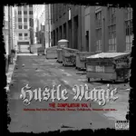
ok, inbetween erasing some of my whack ass beats i had time to add a little to the picture. i added black font and a little effect to the original title of the cd to give it a Money look, it turned out pretty descent i think. if i had the original files, it could have came out a little better.