SonicAlbert said:
I'm having a hard time reading it. Actually, I'm not reading it at all because it kills my eyes after a very short time. Which I find unfortunate because you put a lot of time into it and I'd like to read what you have to say. My monitor is calibrated properly (Apple Cinema display
There's a book you should read called "Type & Layout", by Colin Wheildon. It's an absolutely brilliant book in my opinion, and quite unique. After studying the concepts put forth in "Type & Layout", I highly doubt you will ever use colored text on black background again.
I know that light on black went out of style with the Apple/Windows GUI. For me, light-colored backgrounds are far more of an eye strain than a well-selected light on black. I know I am kind of the oddball with the old-school black background (don't forget, we went 40 years with black backgrounds on our computer terminals with no issues), but there is more than that going on here.
I have read more books on the subject over the past 12 years than I could possibly count, and I don't choose my color schemes arbitrarily or just because they look pretty. There are technical and ergonomic reasons behind each specific color chosen (I have been at this racket for quite a while.) I gotta be honest, Al. I'm picking a robust, bold font there (Arial 10pt bold, with Verdana 10pt Bold as the backup) at 75% saturation in 2 of the 3 component colors. If you are having trouble reading that, there is a problem somewhere beyond the page design itself. If it's too low contrast for you to read mostly comfortably, I'd next ask if maybe your copy of the OS is missing the proper font to represent/replace Arial Bold. I could see if you were not getting a bold font that even on the best of CRTs or LCDs that it'd be tough to read. That would make sense. But if you're getting a bold font and you can't read it because the contrast is simply too low, then I'd highly suspect a display problem.
If I boost that color any brighter on any of my three monitors here (2 tube, one LCD, one tube with dual brightness settings) it's almost like shooting a green laser into the eyeball, it actually hurts after a a sentence or two. Remember that although we may have anywhere between 32,000 and scores of millions of colors available to us (depending upon our video cards), the web browser standars themselves limit us to only ~216+ colors on our font selection pallate. The next step up in the browser pallate is just waaaay too bright.
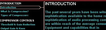
Here's a test. I have attached a screenshot of the page as it appears on my system. This will do two things: first it will allow you to compare fonts. If your Mac is missing or mis-choosing Arial Bold or it's Mac bold sans serif equivelant, this comparison may show it. Second, your browser should represent the jpeg screenshot fairly faithfully as far as color depth and contrast, not limited to the couple of hundred of colors in font display. This might give you a better look as to how the font brightness and contrast should come out. If the screenshot still loks dark and un-contrasty on your screen, then I'd have to honestly say the problem is somewhere on your side of the firewall, unfortunately.
The image is an unretouched screen capture using the Windows inherent print screen clipboard and Adobe Photoshop. Other than cropping the image borders to a smaller area and using some light JPEG compression to fit HRs 64K bandwidth restriction, I have made absolutely no adjustments to the captured image. What you see is what I got.
G.
[EDIT:] You can print out the text if you wish by just selecting "print" from the main content frame. It will print out as black on white.
Then again, Al, I seriously doubt that there's anything I've written that you don't already know. You know your audio stuff, and what I have here is fairly basic. But I can understand your desire to read it anyway.
")

")
 :rolleyes:") .
.