TerraMortim
New member
That's not a design, it's just a photograph. That EP was released in a copy of 5, and it's the only thing I've done for my old band graphics wise. Besides, define professional.

IMO one of the best CD-art I've ever seen. Far cry from good or professional? Personally I couldn't care less
I like that too... I wouldn't say it's not good though. It has good composition, it fits the music on the inside.... it has a very stylized look, really.

 )
)

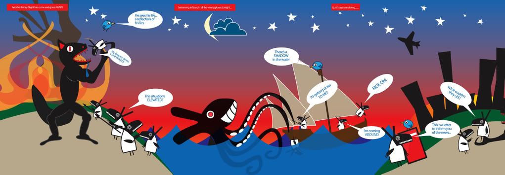
") I wanted to take the idea of a bosch painting, but instead of the subject being heaven vs. hell... stupidity vs. anything good, intelligent, and so on.
I wanted to take the idea of a bosch painting, but instead of the subject being heaven vs. hell... stupidity vs. anything good, intelligent, and so on.