Looks Good
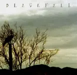
Good design. Gets that "lonely road through the countryside at dusk" feeling going. Nice job.
If I had to pick a nit, I'd say play with the text a little, maybe flatten it out and integrate it into the background image a little more, but honestly, it's more a matter of personal taste than design sense - it's fine the way it is.
I can't tell since the attached image is a JPEG, but just make sure your image is CMYK, not RGB. Even if it isn't, I doubt you will have much difficulty, as most of your colors seem to be fairly muted and "CMYK friendly".
JUST in case you have aboslutely no idea what I'm talking about...
RGB = Red, Green, Blue - color model used to create computer/web/broadcast graphics, designed to be shown on a lit screen.
CMYK = Cyan, Magenta, Yellow, blacK - color components used to create print graphics, designed to be printed on paper.
Often, the colors in RGB images will look completely different when converted to CMYK for printing, due to the differences in the two color models.
Finally, make sure your image is at least 300dpi (Dots Per Inch, 200dpi MINIMUM, 300dpi is the standard for print), and the dimensions of the final artwork match the dimensions of the printed artwork. Small images stretched to large sizes usually look really, really bad.
Best of luck with your CD.


