You are using an out of date browser. It may not display this or other websites correctly.
You should upgrade or use an alternative browser.
You should upgrade or use an alternative browser.
Outlaws
New member
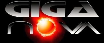
I would space the "V" and "A" out a bit. The other two have nice amounts of kerning, but those two are too close and present two different styles that don't sit well with each other. If everrything was like that for "NOVA" then it would work. You can have the Sun with more kerning, but you would need another letter (which "nova" doesn't permit) to be with the "N" so that it would sit well and that line of copy would work. But thats not the case.
I
invisiblenemies
Active member
Do you need the name of a program? Or a graphic designer to create it for you?
Nevertheless, I agree with the previous post concerning the spacing. It looks cool...but it's not balanced well.
Nevertheless, I agree with the previous post concerning the spacing. It looks cool...but it's not balanced well.
Last edited:
Giganova
gimmi your mic!
Massive Master
www.massivemastering.com
I think it's kinda cool...
Should get you a few giga's. Er... Gigs...
Should get you a few giga's. Er... Gigs...
Outlaws
New member
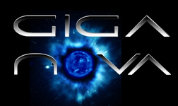
Giganova said:Thanks for your ideas and suggestions! Below is a new version -- any better?
The blue? Yes.
Now you need to look around Photoshop for a thing called "feather". Then use that with the selection tool and the delete key.
") (it'll help you move outside of the "box")
(it'll help you move outside of the "box")Then you should mess around with the "VA". Still isn't sitting well.
Outlaws
New member
Acutally, I would try it all on one line. Might give you some new ideas to think about.