You are using an out of date browser. It may not display this or other websites correctly.
You should upgrade or use an alternative browser.
You should upgrade or use an alternative browser.
How to read this graph
- Thread starter Mlaq
- Start date

Random dude
Well-known member
Why are you starting a new thread posting the exact same thing you posted here? https://homerecording.com/bbs/threads/vocal-assessment.425894/#post-4841003
You got a great answer from Rob in the other thread. Is it because you didn't get the answer you wanted do to hear? That's peculiar.
You got a great answer from Rob in the other thread. Is it because you didn't get the answer you wanted do to hear? That's peculiar.
Random dude
Well-known member
Well, forgive me if I misunderstood, but in the other thread, you posted the same graph and asked "can anyone help me understand this".
Now, you're posting the same thing (I know it's not the same exact picture, but it's the same graph) and asking "How to read this graph".
Looks like the exact same question with different words.
But anyway, I'll stay out of your way and go "pay attention" to something worth "paying attention" to. Have a great day and good luck.")
Now, you're posting the same thing (I know it's not the same exact picture, but it's the same graph) and asking "How to read this graph".
Looks like the exact same question with different words.
But anyway, I'll stay out of your way and go "pay attention" to something worth "paying attention" to. Have a great day and good luck.
gecko zzed
Grumpy Mod
Whar's with the attitude?
This is what Rob wrote in the earlier thread:
"The display shows the length of the notes you sang left to right and the pitch of the notes on the vertical axis. "
This is what Rob wrote in the earlier thread:
"The display shows the length of the notes you sang left to right and the pitch of the notes on the vertical axis. "
rob aylestone
Moderator
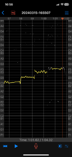
Look at the horizontal lines - the ones on the thicker lines are C - then there are twelve above leading to the next C - so one slot for each note on the piano keyboard. Frankly - the letter names are just guides. So you sing a note and the note shows up at the pitch you sang. The wobbly lines denote vibrato - so a little above and a little below each note the average is the pitch people hear. Too much wobble, and it's horrible to listen too, unless you're very famous and do it really well. What we are seeing is missed notes - ending up between notes on the piano - lots of 'wobble' and glissandos, sliding up to notes. What it cannot show is if the pitches are correct, for that we need the music, or the track. All it displays are pitches and how long you sang them - which I thought I had explained.
For the record - here it is protocol to start one topic, and then you can sidetrack a little in that one. That way people don't get confused. It also does indeed read like you got ticked off and tried to find a new audience, but on this forum, people usually use it by clicking on new posts - so we all see everything. That's why we hate duplicates, or very, very close duplicates.
I'm a bit stuck why you can't see this - it's your app, but we're all looking at it and nodding. It really should be self explanatory. What are you struggling with? Maybe we're just not understanding what it is you want to know.
Slouching Raymond
Well-known member
It looks clearer in this example.
The faint horizontal lines are incrementing semi-tones.
The thicker horizontal lines mark the C at each octave.
time runs from left to right.
What puzzeled me is the letters and numbers at the side, which don't pick out the same notes in each octave.
The faint horizontal lines are incrementing semi-tones.
The thicker horizontal lines mark the C at each octave.
time runs from left to right.
What puzzeled me is the letters and numbers at the side, which don't pick out the same notes in each octave.
rob aylestone
Moderator
It's actually a nice useful app isn't it!